
Client: Alberta Society of Radiologists
It isn’t easy to hide from a radiologist.
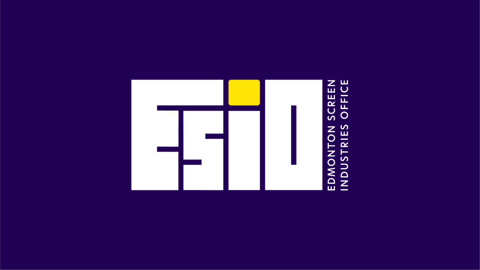
Client: Edmonton Screen Industries Office
Lights, camera… branding.
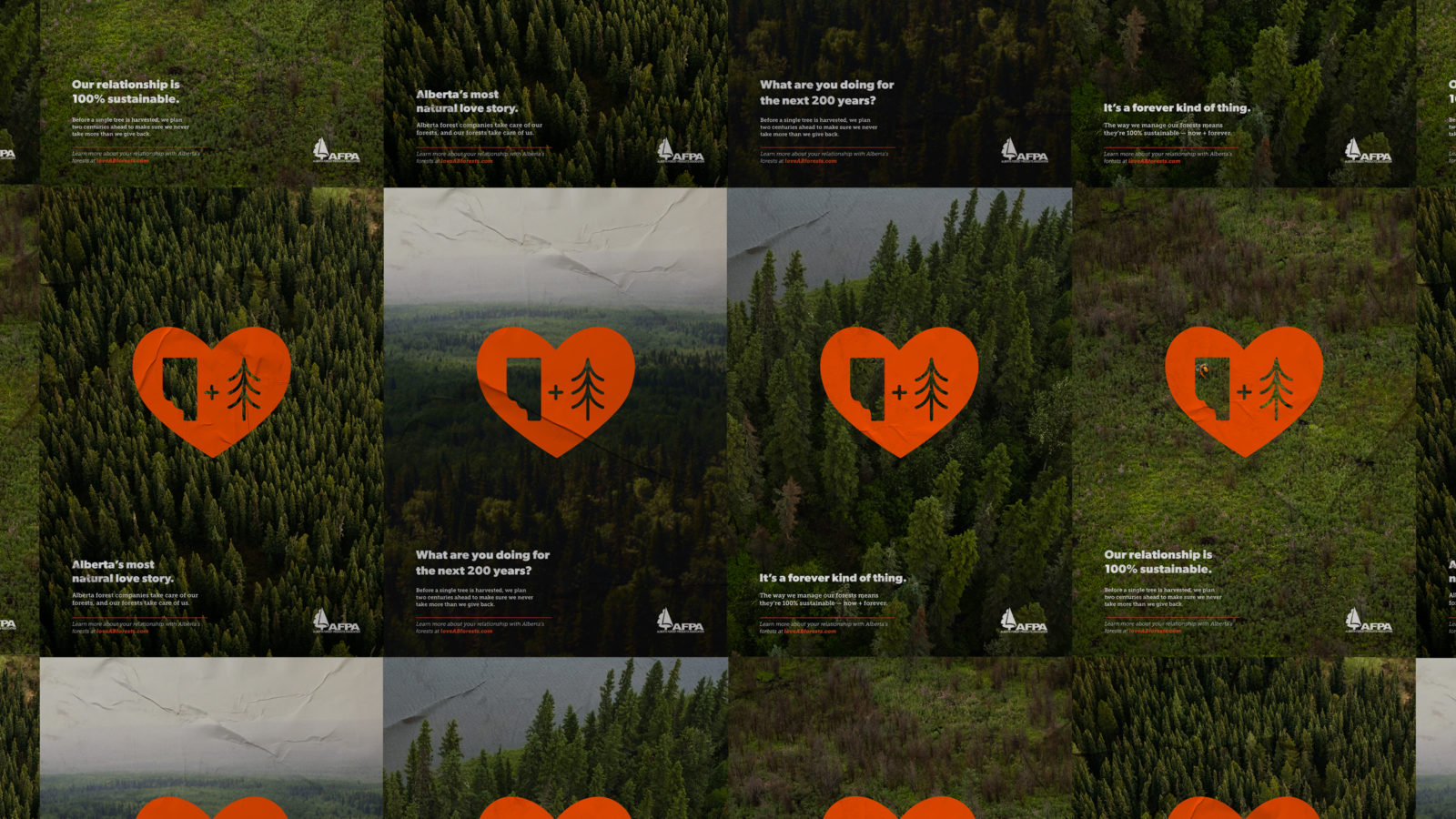
Client: Alberta Forest Products Association
Love. Alberta. Forests.

Client: Royal Alexandra Hospital Foundation
Fires, floods, and (finally) funding

Client: Various
Logo & Identity System Design
Client: Various
Designed Materials
Putting you in the driver’s seat on issues that matter
We are an integrated communications agency firmly embedded in Alberta’s government, media and public policy landscapes.
We do our best work at the intersection of government, industry, and non-profit, quasi-public sectors.

Your win, tailored to your needs
In generating wins for our clients, we draw from our unique bank of services —whether that’s a single media conference, a multi-channel advocacy campaign, or something in between.
- Advocacy Campaigns
- Public & Media Relations
- Strategic Positioning and Brand
- Design & Production Services